Welcome to the new Mad in Crafts design! After much toiling and typing and under-the-breath muttering, I have completed the revamp of the blog.
I want to you to feel at home here, so today I will give you a tour of the joint so you won’t get lost on the way to the bathroom in the middle of the night.
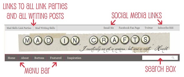
At the top of the page is a header with several functions. The links on the top left corner will take you to the archives of all past Mad Skills Link Parties or all the Mad Writing Skills posts, depending on which you choose.
All the Mad in Crafts contact information is located on the top right side of the header.
The menu bar is similar to the old site with the addition of an “Inspiration” link. This link will show you the blogs that I love and that inspire me day after day.
The search box is a little inconspicuous, but it works much better than the Google-powered search feature on the old design.
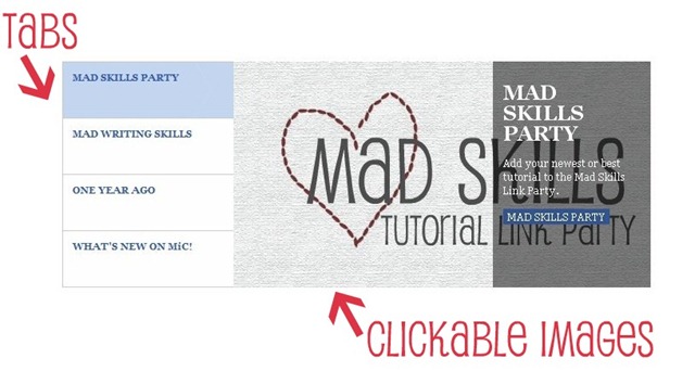
The featured posts slider features some cool, um, features. The slider will automatically scroll through the slides, but if you would like to skip to one slide in particular, just click on the corresponding tab on the left side.
Each slide will feature an image and a brief description of the post. You can click on the image or the description to be taken directly to that post.
The slider will always contain links to the most recent Mad Skills Link Party, the most recent Mad Writing Skills post, a featured year-old post from MiC, and the newest post on the blog. Occasionally, I will feature other posts in the slider as well.
I hope you don’t all hate me, but I did truncate my posts. Let the rotten tomato throwing begin. I outlined my decision to do it here, and I hope I don’t lose too many of you because of it. When you click the link, it opens up a lovely full-page version of the post in all its goofy glory.
When you are on the home page of MiC, the center column contains lots of goodies.
My contact buttons are disguised as typewriter keys, so I included your own personal decoder ring to help you out. I love hearing from my readers and would be excited to be your friend on Stumble Upon, even though I don’t know how to work it.
You can become a follower, if you aren’t already, by adding yourself to my Google Friend Connect.
Click the “Like” button on the FB widget to easily add yourself as a fan of the Mad in Crafts facebook page.
The Twitter widget gives you a taste of my twitter wit (or lack thereof).
Finally, the Feedjit widget tells me where you guys are from!
That is an awful image, but the buttons on the right side of the page (whether you are on the home page or a post page) correspond to all the labels of my posts. Now you can easily see and find all my crazy knock-offs just by clicking the button.
That is the basic lay of the land, and I hope it is all fairly intuitive. If you have any questions about where things are or how things work, please let me know!


I think the place looks great! Thanks for the 10 cent tour-lol-it was helpful! 😉
Wow, you've been hard at work! I love the new feel of the blog!One thing though: on my screen, that top bar (with the party links and social stuff) is dark gray, not light like in your picture. Because it's dark gray, you can't read the dark gray words. I don't know if this is just my computer, or if it's a glitch, but I thought you might want to know!
Lookin'good…no lookin' AWESOME!! Great Job!!May I ask a question? I'd love to have the little social media buttons like you do after your "posted by" line. Can you point me in the right direction?Thanks and have a great week!