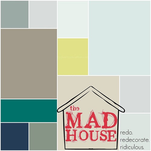
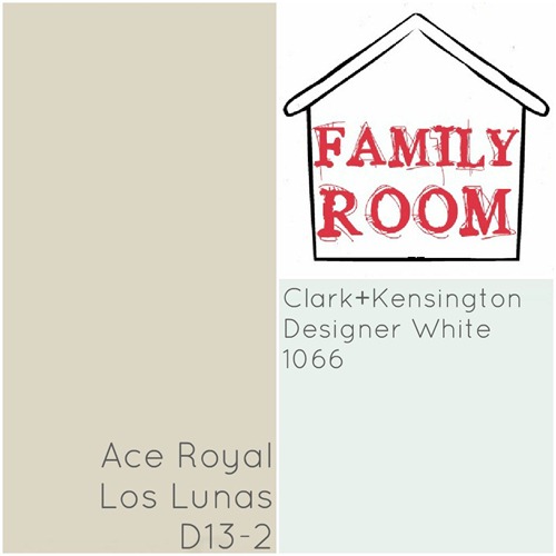
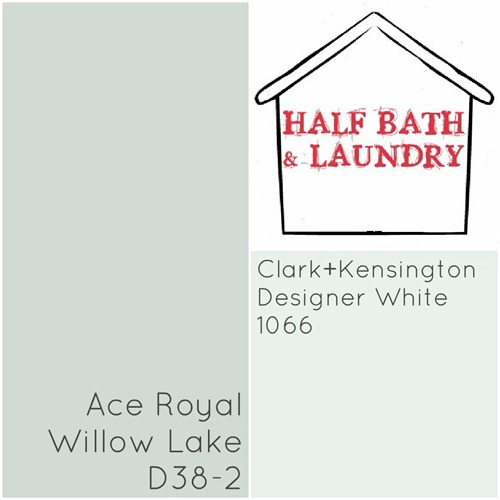
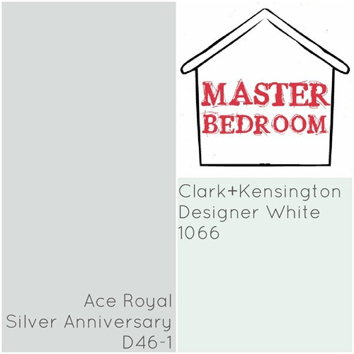
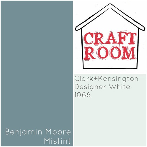
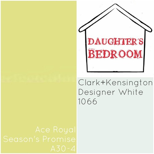
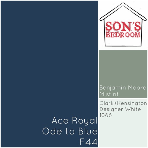
I thought some of you might be interested in exactly which paint colors we ended up using in The Mad House. Below is a color palette for each of our rooms and the information for each color, as best as I could give you. Over the coming weeks, I will take you through the house and show you the “finished” rooms. You know with a craft/ DIY blogger, a room is never really finished.
All of the hallways in the house are painted in the same Designer White you see in all the rooms; it’s a white with a hint of blue to it. You don’t notice the blue when you see it on the walls or ceilings, but it keeps any of the surfaces from looking yellowed.
Remember to follow the lessons I learned the hard way and have your Clark+Kensington colors color matched and buy the Ace Royal paint. It is a much better paint for the same price.
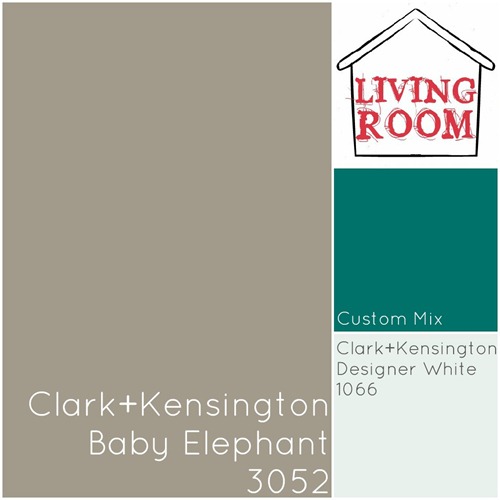
I used the custom mixed paint on the backs of the built-ins around our fireplace. I mixed together a 7.2 ounce sample of Valspar’s Pond with a few ounces of the paint I used in the craft room to get a medium teal color.
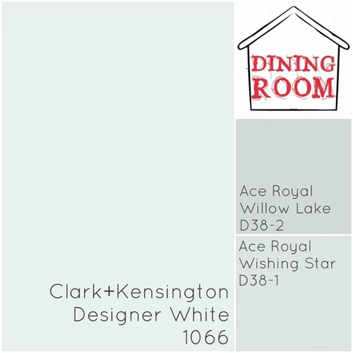
To create a tone-on-tone look for the dining room stencil, I painted the top of the dining room walls with matte Wishing Star. I used Willow Lake in semi-gloss with the stencil so there is slight contract in color, but high contrast in sheen.
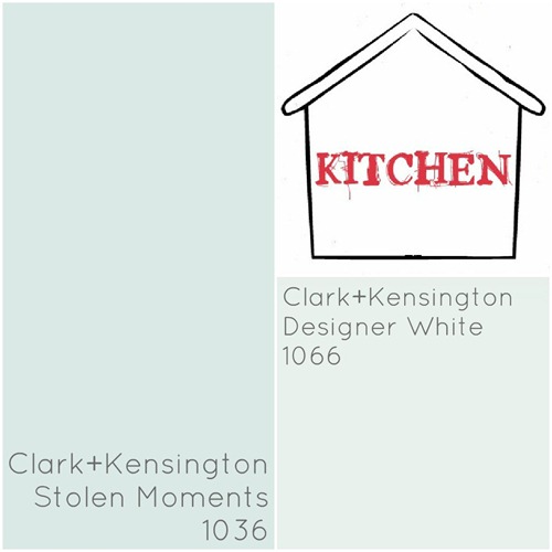
I also used a semi-gloss finish in the kitchen for easier clean up.
The Los Lunas color looks a bit more pink in person than it does on the chip. It is a nice neutral color for a large space.
There was plenty of leftover Willow Lake semi-gloss after finishing the dining room, so we used that paint to finish the half bath.
After trying and rejecting C+K’s Lucky Charm for our master bedroom walls, I settled on this muted tone for the room and the upstairs bathroom.
Many large paint stores carry “Oops Paint” or mistints at a huge discount. These are paints that were mixed for a customer but, for what ever reason, they decided not to buy the paint. Since it’s illegal to just throw paint away, the store sell the unwanted colors for cheap to recoup a little of their money. I got two gallons of Benjamin Moore paint, in really nice colors, for less than 1/5 the normal price.
DISCLAIMER!!! This chip does NOT accurately represent how the color looks on the wall! In real life, the paint is a much brighter, almost neon yellow-green. Not for the faint of heart!
Finding the right blue is tricky, but this shade from Ace Royal is a rich blue, just between royal blue and navy. The army grey was another lucky mistint find.
Do any of these colors strike your fancy? Do you think you might try any of them in your home?

